Dick gets hands on

Author: Bob Pank#
Published 1st March 2012
There is a new buzz phrase in computer magazines at the moment. It is “digital skeuomorphism”, an expression which has come to describe the way that a user interface is designed to look like something else.
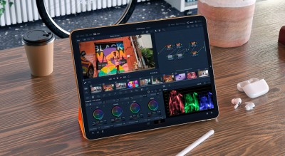
To give an example of digital skeuomorphism, the picture is of my iPad calendar. The point is not to show how busy I am at NAB, but to show the way that the iPad calendar app looks: like an old fashioned jotter type calendar, complete with little jagged edges from where the previous week’s page has been torn out. To scroll from week to week, the screen does a little flourish to show the page being turned back.
There is no reason at all for the user interface to do this. Someone in Cupertino thought it was nice. They convinced Jobs and Ive that it was nice, and so that is what the app looks like.
According to the Oxford English Dictionary, a skeuomorph is “an object or feature copying the design of a similar artefact in another material”. In this case it is an electronic diary looking like a bound and torn stack of paper. This idea of making something slick and modern look like something old and comforting is around everywhere at the moment. Some people get worked up about it, one way or the other. I cannot get excited: so long as it works and gives me the information quickly I am not really worried about what it looks like.
What is interesting, though, is that this current meaning of the word is actually the second definition in the OED. The primary definition of a skeuomorph is “an ornament or ornamental design on an artefact resulting from the nature of the material used or the method of working it”.
So while the Levi’s I am wearing while typing this probably do not need rivets to hold the pockets on, they did once, and so a distinctive piece of ornamentation has been created: a skeuomorph. You could just as easily make jeans without rivets, though.
It was thinking about this that led me to start thinking about user interfaces. The traditional user interfaces for equipment in our industry, by and large, came about because that was how the hardware needed to be, and how the user needed it to be.
An analogue audio mixer had to be built as a set of discrete boards, one for each input channel. That meant that each microphone had its own set of equalisation controls and sends, and each had its own fader. Anyone who has mixed music live knows how intuitive it is to be able to sit with all the important faders under the fingers, making subtle adjustments continually.
I still occasionally get asked to produce albums for friends, except now I do the post production in software on my Mac. And I know that it is massively more time-consuming because I do not have my fingers on the faders, I have to use a computer interface which removes me from that direct and instant control.
Bret Victor used to be a senior designer at Apple. Now he is an independent thinker on leading edge technology, and on his website there is a splendid paper called A brief rant on the future of interaction design. http://goo.gl/usOou
In it he makes some very telling points. In particular, he says that our current fascination with touch screens – like my iPad – could be leading us in the wrong direction, because it removes from the interaction a unique ability which millions of years of evolution have given us: the incredible sensitivity and control in our fingers. There is a reason why one of the densest areas of nerve endings is in our fingertips.
When we listen to, say, Yo Yo Ma play the cello, what moves us is the way that he uses that sensitivity and control. His left hand is placed precisely on the strings to remarkable tolerances, and the tiniest changes in pressure transform the quality of the sound. That is never going to be possible with a touch screen user interface.
Is there a conceptual difference between the way that a concert pianist strikes precisely the right keys at precisely the right moments and the way that a vision mixer uses a big production switcher in a live programme or sports match? If you want to change the user interface for a switcher, then you have to move to something which is going to be as precise as well as something which is as intuitive to use, without looking at the interface. Otherwise, banks of buttons under our sensitive fingers is a pretty good way to work.
I think one of the technology trends for the next year or two will be new interfaces for familiar processes. Touch screens are already with us, and will become more pervasive, I am sure. The next generation will bring more haptic technologies to the mix, providing physical feedback as response and resistance. But I urge designers to remember that, as a species, we are good with our hands.