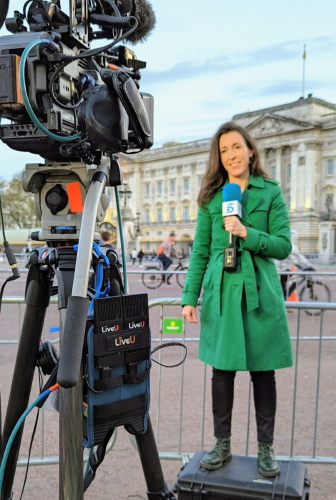
The BBC has launched its new personalised music, radio and podcast app with a campaign that follows one listener’s journey from meeting Kylie Minogue in a lift to Idris Elba on a bus.
BBC Sounds offers a single home for the BBC’s thousands of hours of audio content, including live and on-demand shows and special music mixes curated by artists.
BBC Creative, the broadcaster’s in-house creative division, took the brief to agency Riff Raff Films and Megaforce directing duo of Charles Brisgand and Raphaël Rodriguez who in turn brought on board regular collaborators Time Based Arts.
“We have a good relationship with the directors and DoP Nicolas Loir [with whom the post house worked on Nike spot Nothing Beats A Londoner] and they are pretty savvy with grading and have a good knowledge of Resolve,” says head of colour grading, Simone Grattarola. “That helps give us all a good short hand for communicating a unified vision for the project.”
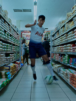
To prepare for the grade, the creatives shared ideas and references with Grattarola for the spot which is composed of a dozen vignettes with the narrative thread of the listener’s journey. Shot on ARRI Alexa, the film features a number of different celebrities shot on different days in scenarios.
“The aim was to make sure the piece felt continuous and that each scene was a part of her world,” he says. “We had to find a visual consistency as she travels through a day while giving each scene a little twist or visual punctuation.”
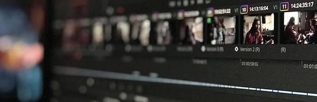
Showing the images at a smaller scale is also important for the perspective it gives the creatives on how the finished spot will look to people on their phones.
“During the final session I’ll make a QuickTime and send to everyone’s laptops and phones in the room so we can see if it’s maybe too dark or too light and make those adjustments. You have to take the smallest screen into consideration since for so many people it’s the most important.”
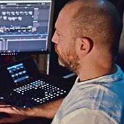
Grattarola likes to begin the grade by using Resolve to display a range of key shots from the footage and analyse them with the creatives.
“We picked about 10 key shots and looked at a close-up and wide on each to see how it all fits together. I’ll throw them up using Resolve’s split screen function, like a little collage. It’s a really good starting point because you can play them all back, see them full frame rather than examining the intricacies of the image, and in doing so you get a general idea of content, colour and contrast.”
He continues, “Because Megaforce and Nicolas understand the basics of colour grading we riffed quite a lot of ideas off of each other. They’re prepared to take risks and try something new which is really healthy because it means we’re rebounding off each other creatively and the spot takes shape incrementally.”
Grattarola added subtleties of texture throughout the whole piece, increasing the grain in slightly darker scenes “to feel as if the film stock was being pushed a little bit.”
To smooth the transitions between scenes he took a cue from colours in the preceding scene. A sequence at a swimming baths, for example, was given a heightened blue-green background to segue from the warmer tones and blue palette of preceding scenes in a kitchen/nightclub and train station.
“In the supermarket we heightened the yellow of cereal packets that get knocked over to help bring us into the next world where the girls are sat around a table in a café which has a more natural yellow colour to its wooden walls.”
The sequence demanding most work was the transition between the lead character running from outside the café along a street and passing what seems like a giant fish tank.
“The first part of that was shot in mid-afternoon and the fish tank at night so we applied sky replacement, killed some shadows thrown by the sun and added shapes to make the light appear gradually darker over 4-5 shots,” explains Grattarola.
“It’s slightly illogical if you think that her running would take two hours from dusk to darkness rather than the seconds in which you see it, but these little changes help prevent the whole link together.”
Grattarola has been working with Da Vinci for fourteen years since his time as colourist at facility Rushes. “When I partnered with Mike and James to set up the grading department at Time Based Arts I was keen to use a system that I was comfortable with and one that I think a lot of DoPs and directors understand as well. We also do lot of long form work and it was a massive consideration for us to have a system that was understood from production and on set into post.
“Resolve is kind of like a common language we all share.
“For instance, instead of trying to describe colours over email I can send DRX files. I find directors and DoPs also understand Resolve’s ‘node tree’ approach to colour grading. This is where each layer is a colour effect which can be connected to other nodes, creating a node ‘tree’ of multiple effects.
“Sharing this knowledge is a really healthy way to work. We don’t want to ever frustrate the DP since we’re all about fulfilling their vision. Resolve breaks down those barriers. Grading is no longer a dark art.”