Why does my project look different on every screen I watch it on?

Author: Thomas Urbye
Published 1st February 2013
By Thomas Urbye
The age old question, asked by so many people who’ve come through my suite: “I’ve downloaded it to my laptop and it looks different?”
Then there is the inevitable panic:
“Thomas, how can we make sure that everyone who watches it, watches it ‘properly’?”
This issue recently came to light with a campaign backed by moviemakers launched to make sure films are watched "as the director intended".
As a colourist, I’ve spent a great deal of time learning to understand colour science, thanks to years of discussions and teachings with friends like Martin Parsons @ Image Eyes and Steve Shaw @ Light Illusion. We’ve had many chats over different screens and different technologies, and discussed the question asked by Producers, Directors and DPs the world over: “Why does my work look different on every screen?”
I’m going to set out why it does, a brief note on the technology and finally, why it doesn’t matter as much as you think.
A visit to my company’s website will quickly tell you that colour is very important to our business revenue, we are predominantly a colour grading company, and clients from all sectors of the industry use us to make their work look as special as it can, in real terms, adding value to what was shot and hopefully taking the image beyond what the client ever thought possible. In a world where software colour grading tools, like editing and desktop publishing, is pretty much free, anyone can be a colourist now – just like they can be a graphic designer or editor.
The difference is how quickly you get to the absolute best result, your understanding of your profession, your client skills, the client experience, delivering on time and knowing that your screens are calibrated…….
A lot of people think that there isn’t a standard for colour on screens, but there is.
We have a lot of screens at The Look, all of them using different panel technologies inside – we have LCD, LED, Plasma and projection. They have varying price points, various issues inherent with their design, and they have varying controls over their calibration. But this article isn’t about the intricacies of different panels and the complicated world of colour science.
The current standard of HD TV screens and content delivery, the world over, is known as Rec. 709 and you might be surprised to learn, that most panels inside the TVs you buy are roughly calibrated to this standard. The problem arises when TV manufacturers add special ‘features’ to the TV itself (rather than the actual panel) so that it appears sharper and more impressive on a shop floor against its competitors. The ones that drive us colour specialists mad is anything with the word ‘dynamic’ in it. Dynamic Contrast, Smooth Motion, Noise Reduction and various settings like ‘Game’, ‘Dynamic’, ‘Sports’ etc. all play havoc with the image displayed, heightening colours and increasing the contrast, usually causing any detail in the image which is in the darker or lighter areas to disappear completely as the panel is worked hard to make the image more intense – any subtlety is gone – it’s like turning up the bass and treble on your amp and wondering why certain songs sound terrible, while others seem to sound more ‘epic’.
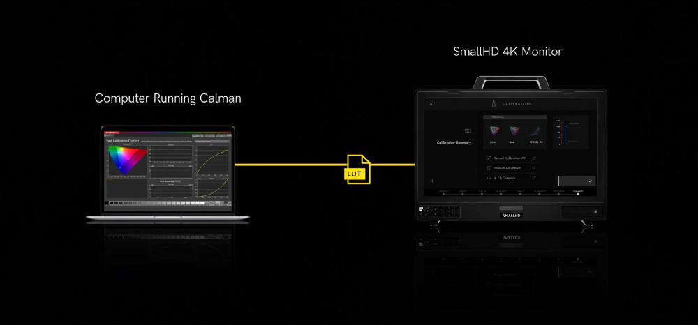
If you actually turn off everything, and set the TV to standard you might be surprised to know, and this is in my experience true even with consumer sets, that they aren’t that far off the Rec. 709 standard. At The Look we measure the black level (to make sure picture information isn’t being cut off, or isn’t too ‘lifted’) and we also measure, using a special probe and specialist software, how bright the TV is when a pure white image is put in to it. We then measure pure Red, pure Green and pure Blue to see if it’s close to the Rec. 709 standard. We then check a grey scale to confirm that there isn’t a strange colour cast or tint to the panel.
Interestingly, with most HD panels from decent manufacturers, you can get them pretty close to the standard, certainly for home viewing.
Why bother with any of this?
Because you should want to watch programmes, feature films and commercials as they were colour graded by people like me and the Directors and Cinematographers I work with, and my other fellow Colourists the world over who’ve calibrated our screens. Thankfully, digital cinema now means that when you go to your local cinema, it should be pretty accurate to what we saw – well, if it’s properly maintained that is.
The chances are you won’t be able to do much more than going to ‘standard’ on your TV, turning off all the extra stuff I mentioned above, and doing a visual calibration with your own eyes on a film you trust – which may sound crazy, but in my experience, my eyes are as good as any probe I’ve used.
Even after this, it’s not going to be perfect by any means, and even in a professional environment we struggle to get every colour at every point in the colour and brightness scale to be accurate to the Rec. 709 standard.
So TVs may seem like a pain to tweak, with all their options and settings. But what about your laptop, your iPad, your iPhone or Samsung Galaxy etc.?
The bad news is, most of these devices don’t have a way of tweaking your screen, they don’t even work to the Rec. 709 standard, some say they work to the sRGB standard, but that’s unlikely out of the box. I recently purchased an iPhone 5, restored my old iPhone 4 settings to it, so in effect they were identical, with the same home image. Put them next to each other and I was gobsmacked at how different the same image looked, the iPhone 5 was significantly warmer in its colour tone.
iPhone 5 on the right has significantly more yellow/warmth in the whites than the iPhone 4 display on the left. Its true to say, if you buy another iPhone 5, put the same image on it, it will probably look different on that one too. So when clients say, “sorry I couldn’t make it to the grade, but I’ve downloaded your link and the product looks a bit yellow to me” I get a little frustrated!
“Thomas, how can we make sure that everyone who watches it, watches it ‘properly’ as we see it on your screen?”
You cant.
But I have an explanation on why you shouldn’t worry too much.
For hundreds, even thousands of years, man has chosen colour by mixing paints and putting this paint on to a canvas, and this canvas would have been lit by both daylight and candle light, and later, by electric lamps of varying colour temperatures, he or she would have carried on working for days and weeks, and just as we cannot change the colour of lamps and sunlight, neither can we accurately control the colour of the screen or the viewing conditions of the millions of people watching our work.
If you visit any gallery in the world, which has natural light as a source, when you visit at 9am and photograph a painting, and return again at 4pm and photograph the same painting with the same settings, the brightness and colour cast could be warmer, or cooler, based on the natural light. This in itself will have changed the way we see the painting, the colours will have changed to our eye, but one key thing to remember is that our brain interprets the information that our eyes transmit to it. If someone is wearing a white t-shirt in an image our brain balances the other colours based on that and other known objects and what colour they are. When someone owns a TV, a laptop and an iPhone, the colour is neutralised by our brain it appears normal (unless you put them next to each other) and it’s only if we have a reference (a logo with strong colours) that we might spot an issue, otherwise, everything seems fine. If your TV is set up a bit wacky, that wacky to you is normal.
However, with the gallery example, we don’t see this as devaluing or ruining a painting or piece of art, it is how the colours are used in the painting (or image) that complement each other perfectly, how the light in the original scene is rendered and controlled, in essence, creating an image that is visually pleasing in whatever environment you watch it in and on. As the image above shows, the scene that I photographed in Austria is equally beautiful on both screens, and if you were to look at one phone, and then turn it off, and turn the other one on, if you did this with even a few seconds gap, the chances are you’d think they were identical – that is how bad our colour memory is.
There is no excuse for anyone who offers grading services, individual or company, not to understand the complexities of display calibration, it is a known standard that manufacturers do work too, and it allows screens that the work is seen on later to be off in a particular direction without major detriment to the viewer’s experience of the image, particularly if you have set your black and white levels properly.
So if you are panicking about how your project is looking different on YouTube, your Quicktime on your laptop (oh the joy of Quicktime gamma issues), YouTube on your iPhone and then when its broadcast, don’t lose too much sleep – it’s never going to change, it’s not as bad as it seems – you just need to make sure you work with people who know why it looks different and how we can counter the issues as much as we can within the controls and knowledge at our disposal.
I leave you with one final thought; years ago I worked on a Channel 4/E4 series here in the UK called ‘Dead Set’. It was directed by Yann Demange, DP was Tat Radcliffe and it was written by Charlie Brooker. I can remember all of us discussing the issues described in this article, and how dark we could realistically go with the colour grade without causing issues for anyone watching this zombie horror during bright daylight hours (it was in places graded and lit in a very moody way), and in an unheard of moment of genius Charlie managed to get the announcer to state before the programme: “Now on E4, ‘Dead Set’, which contains graphic scenes and which is best viewed in a darkened environment”.
I had a wonderful vision of millions of people all reaching up to their light switch and turning off their ‘big light’, and thereby increasing their enjoyment of the work we had done, and actually seeing some more of the gory detail!
There you have it, problem solved.
Thomas Urbye
MD & Senior Colourist, The Look, London


